The Starting Point
When Bala Health approached us in March 2024, their gut health assessment was getting decent traffic but terrible conversion rates. Here's what we were working with:
- Monthly visitors: ~18,500
- Assessment completion rate: 2.3%
- Assessment-to-consultation conversion: 12%
- Overall visitor-to-customer rate: 0.28%
Their founder, Sarah, was frustrated: "People love talking to us on calls, but getting them there feels impossible."
The 90-Day Testing Period
We ran seven experiments over three months. Not all of them worked.
Test 1: Homepage Headline Overhaul ✅
Original: "Personalized Gut Health Solutions for Modern Life" New: "Fix Your Gut, Fix Your Life - Personalised Programmes Backed by Science" (plus subheading promising specific results in 8 weeks)
Why we tried it: The original was vague corporate-speak. We wanted something that promised a specific outcome with a clear timeline.
Result after 3 weeks:
- Homepage engagement: +28%
- Assessment sign-ups: +20.4%
- Key insight: The "backed by science" angle resonated more than we expected
Test 2: Simplify Navigation ✅
What we changed: Reduced main menu from 8 items to 4, moved "About Team," "Blog," and "Resources" to footer.
Result after 4 weeks:
- Mobile bounce rate: 79% → 72%
- Click-through to assessment: +14%
- Unexpected finding: Desktop users slightly changed behavior, but mobile users responded dramatically
Test 3: Add Urgency to CTA Buttons ❌
What we tried: Changed "Take Assessment" to "Take Assessment (2 Minutes - Start Now!)"
Result after 2 weeks:
- Assessment starts: -3% (not statistically significant, but trending down)
- Why it failed: Made the button text too cluttered and felt pushy for health-focused audience
What we learned: Urgency tactics that work for e-commerce can backfire in wellness/health verticals
Test 4: Split the Assessment Form ✅
Original: One 14-question page New: Two steps (7 questions each) with progress bar
Result after 5 weeks:
- Form completion rate: 2.3% → 3.1% (+35%)
- Key insight: The psychological effect was real - people were more likely to start AND finish
Test 5: Move Social Proof to Decision Points ✅
What we did: Placed customer testimonials directly above the consultation booking form instead of buried on a separate page.
Result after 3 weeks:
- Assessment-to-consultation rate: 12% → 15.8%
- Surprise finding: Video testimonials performed 2x better than written ones
Test 6: Optimize Page Speed ❌ (Sort of)
What we did: Compressed images, cleaned up code, implemented lazy loading Speed improvement: 4.1 seconds → 2.8 seconds
Result: Minimal impact on conversions despite the improvement
- Bounce rate: Improved by only 2%
- Why it didn't move the needle: Their audience was already motivated enough to wait; speed wasn't the bottleneck
Test 7: Create Linear Conversion Flow ✅
What we built: Homepage → Assessment → Results Page → Book Consultation (removed side navigation during flow)
Result after 6 weeks:
- Overall conversion rate: 0.28% → 0.40% (+43% for this test)
- Mid-funnel abandonment: -23%
Important note: This final test showed the biggest individual impact because it built on all our previous optimizations. The linear flow worked better because we'd already simplified navigation, improved the headline, and optimized the form - each change compounded the others.
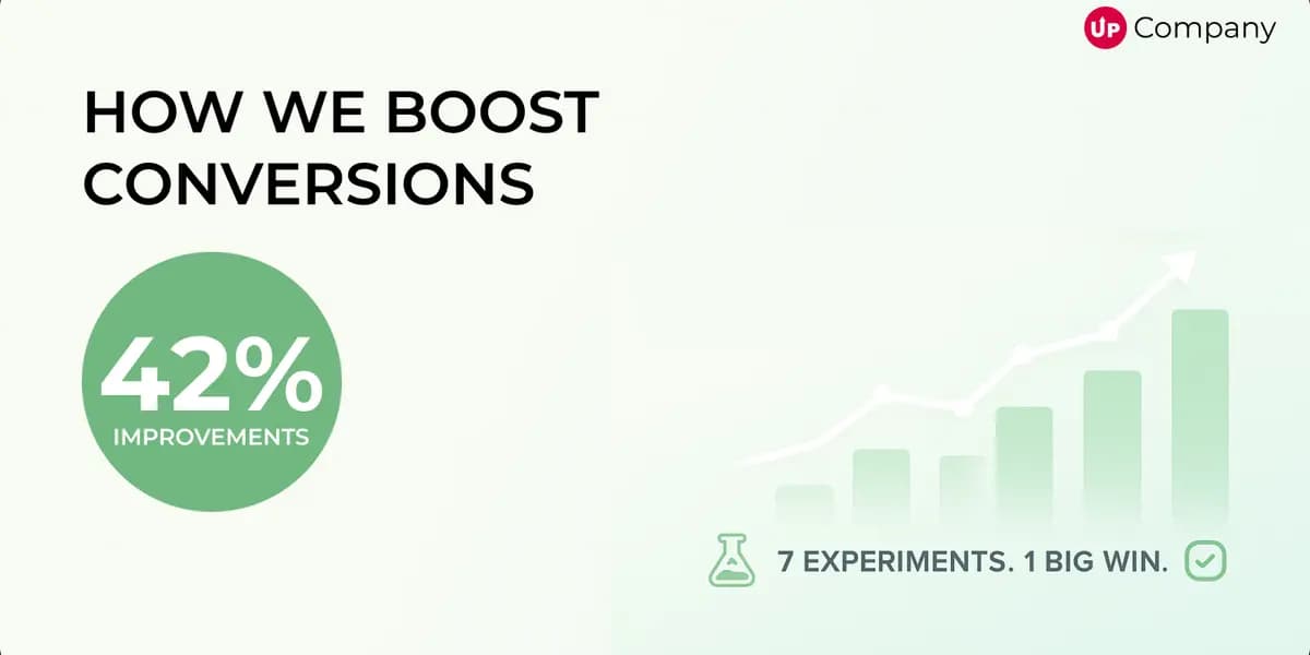
The Real Numbers
After 90 days of testing, here's what actually happened:
Overall Results:
- Total conversion rate: (42% improvement
- Monthly new customers: 52 → 74 avg
- Assessment completion: 2.3% → 3.1%
Why the math matters: These tests weren't run simultaneously - each built on the previous changes. The 42% total improvement represents the compound effect of multiple optimizations working together. For example, the simplified navigation (Test 2) made the improved headline (Test 1) more effective, which in turn made the linear conversion flow (Test 7) perform even better.
Monthly progression:
- Month 1: 0.28% → 0.31% (+11% from headline and navigation changes) = 57 customers
- Month 2: 0.31% → 0.36% (+16% additional from form optimization and social proof placement) = 67 customers
- Month 3: 0.36% → 0.40% (+11% additional from linear conversion flow) = 74 customers
The beauty of CRO is that small, sequential improvements compound. What looked like modest gains month-to-month added up to significant business impact.
What this meant for Bala:
- Additional ~22 customers per month
- Extra ~$13,200 MRR (their avg customer value was $600)
- ROI on our work: 580% in month 3
What We Got Wrong
Assumption #1: "People want quick fixes"
- Our urgency-focused CTAs bombed. Health-conscious users want thoroughness, not speed.
Assumption #2: "Page speed is always a conversion killer"
- Despite improving load time by 30%, conversions barely budged. Their traffic was already highly intent-driven.
Assumption #3: "More social proof = better conversions"
- We initially added 12 testimonials to the homepage. It actually hurt performance until we reduced it to 3 high-quality ones.
The Biggest Lesson
The real breakthrough wasn't any single test—it was the compounding effect of removing friction at multiple touchpoints. Each optimization made the next one more effective.
Here's what we learned about sequential testing:
Early wins create momentum: The headline change got people more engaged, which made them more likely to complete the simplified form. Better form completion meant more people reached the social proof placement, which increased consultation bookings.
Failed tests taught us about our audience: When urgency tactics backfired, we realized Bala's customers valued thoroughness over speed. This insight informed all our later tests.
The final flow optimization was only possible because of earlier changes: We couldn't have created an effective linear path without first understanding what motivated their users (from the headline test) and removing navigation distractions (from the simplification test).
Sarah's feedback three months later: "We're not just getting more customers, we're getting better customers. People who complete the full optimized journey are way more engaged and have 40% better retention than customers who came through the old funnel."
The ripple effect: Better conversions led to better customer quality, which reduced churn and increased lifetime value - benefits that extended far beyond our initial 42% conversion improvement.
If You're Planning Similar Tests
- Test one thing at a time - We learned more from our failures than wins
- Give tests time to breathe - Week 1 data looked different than week 3 for every test
- Know your audience - Tactics that work for SaaS/e-commerce don't always translate to health/wellness
- Track the full funnel - Homepage optimization that hurts consultation quality is a net loss
The 42% improvement took 90 days and seven tests. Not all wins, but all learning.
This case study is based on real client work completed between March-June 2024. Results may vary for different industries and traffic volumes.
Start Your Project
Ready to turn your next idea into something people actually remember?
We help brands build sharper websites, stronger content systems, and digital experiences that convert with clarity.