Landing Page Conversion Tips: Turning Visitors into Paying Customers
I remember the first landing page I ever created. Honestly? It was a disaster.
I spent weeks obsessing over the perfect color scheme, finding just the right stock photos, and crafting what I thought was brilliant copy. The design looked fantastic—clean, professional, exactly what I thought a successful company should have.
Then I launched it, and... crickets. A 1.3% conversion rate. People were visiting, but they sure weren't buying.
That failure taught me something crucial: a beautiful landing page that doesn't convert is basically an expensive digital brochure. And nobody makes money from brochures sitting on a shelf.
The difference between a landing page that converts and one that doesn't isn't usually about having the fanciest design or the most clever copy. It's about understanding psychology, removing friction, and making it ridiculously easy for someone to say "yes."
Your Headline: The Make-or-Break Moment
Here's a brutal truth I learned the hard way—if your headline sucks, nothing else matters.
You have about three seconds before someone decides whether to stay on your page or hit the back button. Three seconds to communicate value, relevance, and why they should care about what you're offering.
I used to write headlines like "Welcome to Our Revolutionary Platform" or "The Best Solution for Your Needs." Generic, vague, and completely useless. They told visitors nothing about what they'd actually get.
The breakthrough came when I started thinking about headlines like the subject line of an email you'd actually open. They need to immediately answer the question: "What's in this for me?"
Instead of "Welcome to Our Marketing Agency," try "We'll Double Your Website Traffic in 60 Days or You Don't Pay." Instead of "Our Software Solutions," try "Cut Your Admin Time in Half Starting This Week."
The difference is specificity and benefit. People don't care about your revolutionary platform—they care about solving their problems. The more precisely you can articulate the transformation they'll experience, the more likely they are to keep reading.
One client of mine was selling online courses. Their original headline was "Learn New Skills Online." It converted at 2.1%. We changed it to "Master Digital Marketing in 30 Days (Even If You're Starting from Zero)" and conversions jumped to 7.4%. Same course, same audience, completely different message.
Your Call-to-Action: The Moment of Truth
Your CTA button is where all your marketing efforts either pay off or fall apart. It's the bridge between interest and action, and most people completely botch it.
The biggest mistake I see? Generic, boring button text. "Submit." "Click Here." "Learn More." These phrases require your brain to work to figure out what will actually happen when you click. And when someone has to think, they usually don't click.
Instead, your CTA should tell people exactly what they're going to get. "Get My Free Marketing Audit." "Start My 30-Day Trial." "Download the Complete Guide." The person clicking should know precisely what's about to happen.
Placement matters too. Your primary CTA needs to be visible without scrolling—what we call "above the fold." But don't just stick it there and call it a day. I usually put the same CTA in 2-3 strategic places throughout the page so people can take action whenever they're ready.
Color psychology is real, but it's not about magic bullet colors that always work. It's about contrast and visibility. Your CTA button should be the most visually prominent element on the page. If it blends in with everything else, you're making it harder for people to take action.
I worked on a SaaS landing page where we tested five different CTA button colors against the same blue background. The bright orange button outperformed everything else by 34%. Not because orange is magical, but because it created the strongest visual contrast.
Less Is More: The Power of Focus
This might be the hardest lesson for most business owners to accept: your landing page is not your website's homepage. It has one job, and that job is not to show off everything your company does.
Every extra element on your page is a potential distraction from your main goal. Navigation menus, sidebar widgets, footer links, social media icons—all of these give visitors ways to leave your page without converting.
The best landing pages I've ever created felt almost uncomfortably focused. No navigation. Minimal footer. Every image, every paragraph, every design element serves the conversion goal.
I once worked with a client who insisted on including links to their blog, their about page, their service descriptions, and their contact page. "But what if people want to learn more about us?" they asked.
Here's the thing: people who want to learn more will find a way to do that after they've taken your desired action. But giving them 15 different options usually just leads to decision paralysis.
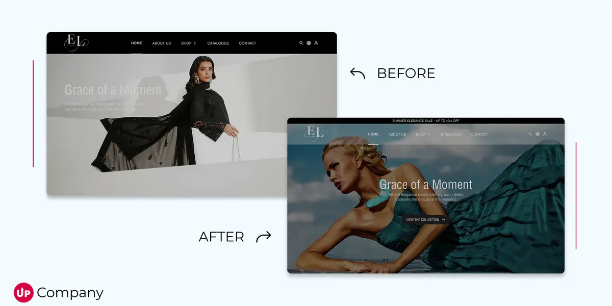
We removed all the extra navigation and focused entirely on the signup process. Conversions increased by 89%. People weren't confused or frustrated—they were relieved to have a clear, obvious path forward.
Building Trust: Why Social Proof Trumps Everything
Nobody wants to be the first person to try something new. We're wired to look for evidence that others have gone before us and succeeded.
This is where social proof becomes absolutely critical. But not all social proof is created equal.
Generic testimonials like "Great service, highly recommended!" are basically worthless. They could have been written by anyone about anything. The social proof that actually converts is specific, detailed, and believable.
Instead of "John S. loves our software," try "Sarah Martinez increased her team's productivity by 40% in the first month using our project management system." Include a photo if possible. Better yet, include specific results and context.
Numbers are incredibly powerful. "Trusted by over 10,000 businesses" is more compelling than "Trusted by many businesses." "Average 300% ROI in 90 days" is more compelling than "Great returns on investment."
Client logos work too, especially if they're recognizable brands. But make sure you actually have permission to use them—nothing kills trust faster than fake social proof.
I helped a consulting firm that was struggling with credibility. Their testimonials were vague and anonymous. We replaced them with specific case studies showing exactly how much revenue their clients had generated, including company names and photos. The conversion rate tripled because people could finally see concrete evidence of success.
The Testing Mindset: Your Page Is Never "Done"
Here's something that took me years to fully accept: even tiny changes can make huge differences in conversion rates.
I'm talking about testing different button colors, trying various headline approaches, switching up the order of information, or even just changing a few words in your copy.
Early in my career, I thought A/B testing was for companies with massive budgets and traffic. Turns out, you can start testing with relatively small amounts of traffic and still get meaningful insights.
The key is testing one element at a time. If you change the headline, the CTA, and the images all at once, you won't know which change actually moved the needle.
Start simple. Test two different headlines for a week and see which one performs better. Then test two different CTA button texts. Then try different layouts or colors.
I worked with an e-commerce client who was convinced their product photos were the problem. We tested the exact same page with different headline approaches first. The winner increased conversions by 23% before we touched a single product image.
Tools like Google Optimize make testing pretty straightforward, even if you're not super technical. The important thing is developing the habit of testing rather than just guessing what might work.
What Actually Drives Results
After working on hundreds of landing pages, I've noticed that the highest-converting ones all share certain characteristics.
They're brutally honest about what they're offering and who it's for. They don't try to appeal to everyone—they speak directly to their ideal customer's specific problems and desires.
They remove every possible source of friction from the conversion process. If someone wants to sign up for a trial, they can do it in 30 seconds without jumping through hoops.
They address objections before people even think of them. Money-back guarantees, free trials, clear explanations of what happens after someone converts—all of this reduces the mental barriers to taking action.
Most importantly, they focus on the transformation, not just the features. People don't buy products; they buy better versions of themselves.
The client I mentioned earlier with the 7.4% conversion rate? Their course taught the same digital marketing tactics as dozens of competitors. But their landing page focused on the emotional outcome—feeling confident and competent in a new career—rather than just listing the modules included in the course.
Ready to boost your conversions? Let's build a high-performing landing page that delivers measurable results—contact us today!
Start Your Project
Ready to turn your next idea into something people actually remember?
We help brands build sharper websites, stronger content systems, and digital experiences that convert with clarity.