Above the Fold: What to Show (and What to Avoid) for Better Conversions
I was helping a client redesign their homepage last month when they said something that stopped me cold: "We need to make sure people know how innovative and cutting-edge we are right when they land on the page."
Their current hero section had a rotating carousel of abstract images, a headline that read "Revolutionary Solutions for Tomorrow," and three different buttons competing for attention.
Their bounce rate was 78%.
The problem wasn't that people didn't understand how innovative they were. The problem was that people had no idea what they actually did.
Your above-the-fold section has one job: help visitors understand what you offer and why they should care, fast enough that they don't hit the back button.
Everything else is just decoration.
You Have About Three Seconds to Make Your Case
Here's what happens when someone lands on your website: they glance around, make a split-second judgment about whether you're relevant to their needs, and either stay or leave.
They're not reading your mission statement. They're not admiring your logo animation. They're scanning for immediate answers to three basic questions: Where am I? What do you do? Is this worth my time?
If your above-the-fold area doesn't answer those questions instantly, you've lost them.
I learned this lesson watching session recordings of real users. People spend maybe two seconds looking at a hero section before they either scroll down (good) or click away (bad). Two seconds to communicate your entire value proposition.
That's why generic headlines like "Solutions for Success" or "Your Partner in Growth" are conversion killers. They tell visitors absolutely nothing useful.
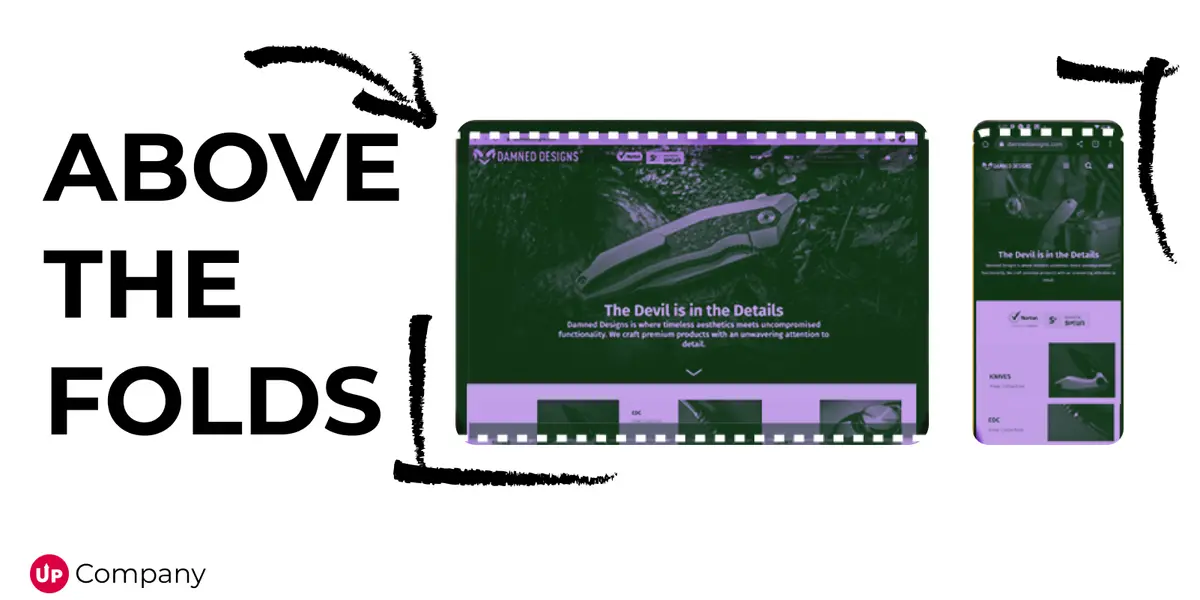
Your Hero Section Is Not an Art Project
The best hero sections I've seen follow a simple formula: clear headline + supporting explanation + obvious call-to-action + relevant visual.
That's it. No rotating banners. No mystery meat navigation. No clever wordplay that requires a PhD to decode.
The headline should explain what you do in terms your customers actually use. If you sell accounting software, don't say "Financial Management Solutions." Say "Accounting Software for Small Businesses."
The subheadline gives you space to explain the main benefit or address a specific pain point. "Get your taxes done in half the time" works better than "Streamline your financial workflows."
The call-to-action tells people exactly what happens next. "See Pricing" is more specific than "Learn More." "Get Free Quote" is clearer than "Get Started."
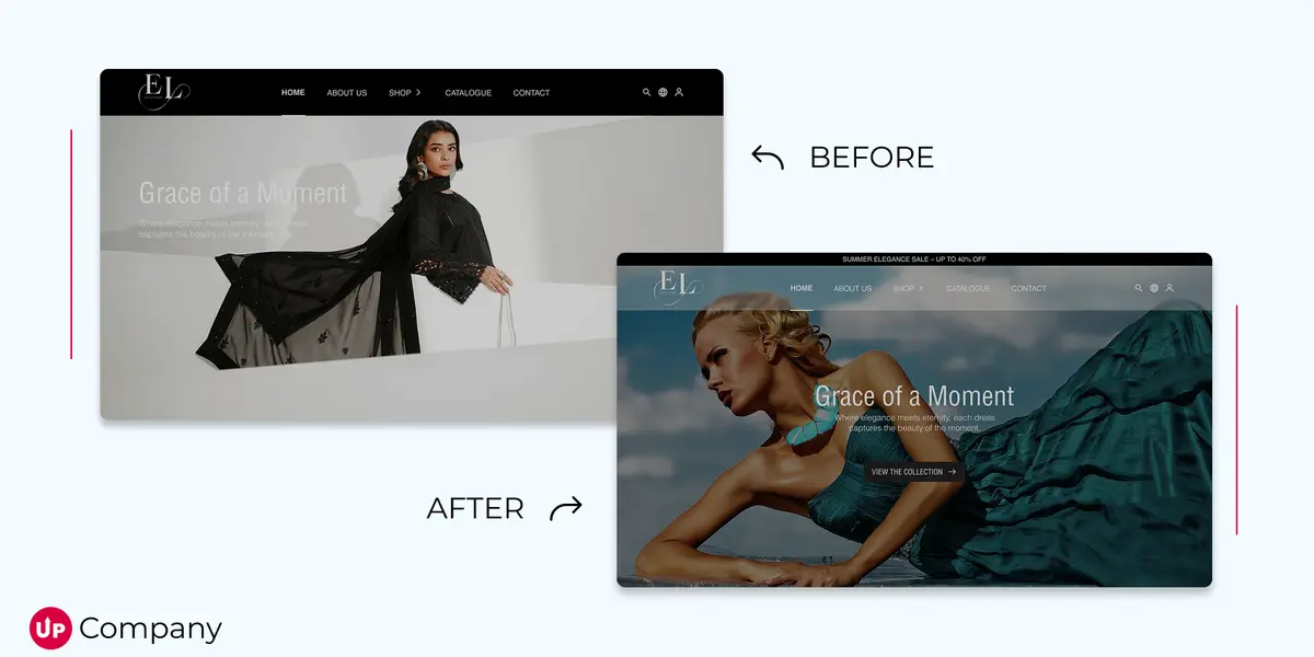
And the visual should support your message, not distract from it. A photo of someone actually using your product beats a stock photo of people shaking hands every single time.
Headlines That Actually Work
I've tested hundreds of headlines over the years, and the ones that convert best have a few things in common: they're specific, they focus on benefits, and they sound like something a real person would say.
"Increase Sales by 30%" beats "Drive Revenue Growth."
"Build Your Website in One Hour" beats "Easy Website Creation."
"Never Lose Another Lead" beats "Advanced CRM Solutions."
Notice the pattern? The better headlines talk about outcomes, not features. They use numbers when possible. They speak to problems people actually have.
Your headline isn't supposed to be clever or creative. It's supposed to be clear and compelling. Save the creativity for your blog posts.
What Ruins First Impressions
I see the same mistakes over and over again in above-the-fold sections:
Auto-playing videos that start blasting sound before people are ready for it. Nothing says "amateur hour" like unexpected noise.
Slider carousels that cycle through different messages. People can't read moving text, and most never see slides 2, 3, and 4 anyway.
Multiple competing calls-to-action that create decision paralysis. "Should I watch the demo, download the guide, or schedule a call?" When everything is important, nothing is important.
Vague, jargon-heavy copy that tries to sound impressive but says nothing useful. "Leveraging synergistic solutions for optimal outcomes" makes people work too hard to understand what you do.
Generic stock photos of business people pointing at laptops or shaking hands. These images add nothing and often make you look less trustworthy.
Your above-the-fold section should feel focused, not busy. Every element should have a clear purpose.
Let the Data Decide
Here's something that surprised me early in my career: my best guesses about what would work were wrong about half the time.
The headline I was sure would convert better often performed worse. The button color I thought was perfect sometimes got ignored. The image that looked great in the mockup didn't resonate with real users.
That's why testing is so important. Change your headline and see what happens to your conversion rate. Try a different call-to-action and measure the results. Swap out your hero image and track engagement.
Heat maps will show you where people are actually looking (hint: it's often not where you think). Scroll tracking reveals how many people make it past your fold. Session recordings let you watch real people interact with your design.
The data doesn't lie, even when it tells you things you don't want to hear.
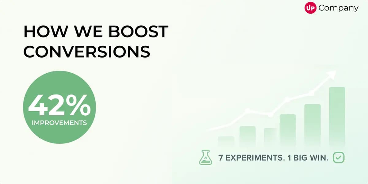
Small Changes, Big Impact
I once helped a client increase their conversion rate by 34% by changing seven words in their headline.
The old headline: "Complete Marketing Solutions for Growing Businesses" The new headline: "Double Your Leads in 90 Days"
Same company, same service, same page design. But the new headline spoke to a specific outcome that their target customers wanted.
Another client saw a 28% improvement just by moving their call-to-action button from the right side of their hero section to the center. People were missing it entirely in its original position.
These aren't dramatic redesigns. They're strategic tweaks based on understanding how people actually use websites.
Your Above-the-Fold Checklist
Before you publish any homepage or landing page, ask yourself:
Can a first-time visitor understand what I do within five seconds of landing here?
Does my headline focus on customer benefits, not company features?
Is my call-to-action specific and obvious?
Does my visual support my message instead of competing with it?
Have I removed anything that doesn't help visitors understand or take action?
If you can answer yes to all of those, you're ahead of 90% of websites out there.
The Real Goal
Your above-the-fold section isn't supposed to sell your entire product or service. It's supposed to earn the scroll.
You want people to think "This looks relevant" and keep reading. You want them to understand enough about your offer that they're willing to invest more time learning about it.
Think of your hero section as a movie trailer, not the whole film. Give people enough information to get interested, but not so much that they feel overwhelmed.
The best above-the-fold designs feel effortless to the user, but they're actually the result of careful strategy and testing. Every word, every image, every button placement serves the goal of keeping relevant visitors engaged.
Your website's first impression might only last a few seconds, but those few seconds determine everything that happens next.
Make them count.
Start Your Project
Ready to turn your next idea into something people actually remember?
We help brands build sharper websites, stronger content systems, and digital experiences that convert with clarity.