Data-Backed Design: Why Guessing Kills Conversions
I've been in way too many meetings where someone points at a website and says, "Can we make that button bigger? I just feel like it should pop more."
Here's the thing: feelings don't pay the bills. Conversions do.
Your website might look incredible. It might win design awards. But if people aren't taking action when they visit, all that beauty is just expensive decoration.
The difference between websites that look good and websites that actually work? One is built on opinions. The other is built on data.
The Real Problem: We're All Just Winging It
Most website decisions happen like this: the CEO has a preference, the designer follows the latest trend, or someone saw a competitor do something and figured they should copy it.
I get it. Design feels subjective. But when you're spending money on ads to drive traffic to a site that doesn't convert, subjectivity becomes expensive really fast.
Think about your last website project. How many decisions were based on actual user behavior versus what looked good in the mockup? Be honest.
This approach leads to predictable problems: high bounce rates, visitors who scroll but don't click, and that sinking feeling when you realize your beautiful new site isn't generating leads.
What Data-Backed Design Actually Means
Let's cut through the jargon. Data-backed design means making decisions based on how real people actually use your website, not how you think they should use it.
Instead of guessing where to put your call-to-action button, you look at where people naturally focus their attention. Instead of picking colors because they match your brand, you test which ones actually get clicked.
The data comes from everywhere: Google Analytics shows you where people give up and leave. Heatmaps reveal which parts of your page get ignored completely. Session recordings let you watch real users struggle with your navigation.
Here's what changed my perspective: users don't care about your design vision. They just want to find what they need and get out. Your job is to make that as easy as possible.
Layout Decisions That Actually Matter
Your page layout shouldn't be an art project. It should be a strategic guide that leads visitors exactly where you want them to go.
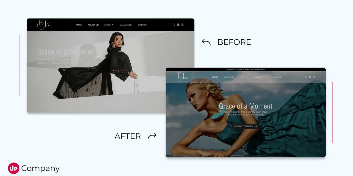
I once worked with a company whose beautiful hero section was completely ignored by 80% of visitors. The analytics showed people were scrolling straight past their main message to find pricing information. So we moved the pricing up, and conversions jumped 34%.
That's the power of designing with data instead of assumptions.
Look at your own analytics. Where do most people stop scrolling? That's probably where your most important information should live. Which pages have the highest exit rates? Those need immediate attention.
Your layout should answer the questions your visitors actually have, in the order they actually have them. Not the order that looks best in your wireframe.
CTAs That People Actually Click
Here's a harsh truth: if your call-to-action has a click rate under 1%, it's basically invisible to your audience.
I've seen businesses obsess over button colors while completely ignoring whether the text makes sense to their visitors. "Learn More" tells me nothing. "See Our Pricing" or "Get My Free Quote" tells me exactly what to expect.
The best CTA copy I've ever seen was "Show Me The Demo" on a software site. It converted 3x better than their previous "Get Started" button. Same product, same page, different words. The data told them what worked.
Button placement matters too, but not in the way most people think. You don't just stick it "above the fold" and call it done. You put it where people are ready to take action. Sometimes that's immediately, sometimes it's after they've read your testimonials.
Test everything. The color, the words, the placement. What works for other companies might bomb for yours.
UX Based on How People Actually Behave
Smooth user experience isn't an accident. It happens when you remove every unnecessary click, every confusing step, every moment where users have to think too hard about what to do next.
I watched session recordings once where users kept clicking on an image thinking it was a button. It wasn't clickable, but it looked like it should be. Five minutes of confusion, then they left. We made it clickable and immediately saw fewer exits on that page.
Your website should work the way people expect it to work, not the way you think it should work. Navigation that makes sense to you might be completely confusing to someone who's never seen your site before.
Load speed kills more conversions than bad design ever will. Every extra second costs you visitors. Mobile users are even less patient than desktop users. If your site doesn't work perfectly on phones, you're losing sales every day.
Testing: Where Good Sites Become Great Sites
The best websites aren't born perfect. They get better through constant testing and improvement.
Here's what most people get wrong about A/B testing: they test everything at once, then can't figure out what actually made the difference. Test one thing at a time. Change the headline, see what happens. Change the button color, see what happens. Build your wins piece by piece.
I've seen a single word change increase conversions by 20%. "Buy Now" versus "Order Now" on an e-commerce site. Same meaning, completely different results. You can't predict this stuff. You have to test it.
The goal isn't to find the perfect version of your page. It's to find a version that works better than what you have now. Then make that better too.
Stop Designing for Yourself
This is the hardest lesson: your opinion doesn't matter. Your customer's behavior does.
Every design choice is a hypothesis. "I think people will click this button." "I think this headline will grab attention." "I think this layout makes sense."
Treat them like hypotheses. Test them. Let the data prove you right or wrong. And when you're wrong (which you will be, frequently), don't take it personally. Take it as valuable information.
The most successful websites I've worked on weren't the prettiest ones. They were the ones that made it easiest for visitors to do what the business needed them to do.
The Bottom Line: Measure Everything, Guess Nothing
Your website isn't a creative expression. It's a business tool. And like any tool, you judge it by how well it works, not how it looks sitting on the shelf.
Guessing is expensive. Every month you spend hoping your current site will start converting better is money left on the table.
Data-backed design isn't about removing creativity. It's about making your creativity actually effective. The most beautiful website in the world is useless if nobody clicks your buttons.
Start small. Pick one element of your site, test two versions, and see which performs better. Then do it again. And again.
Your visitors are already telling you what they want through their behavior. The question is: are you listening?
Start Your Project
Ready to turn your next idea into something people actually remember?
We help brands build sharper websites, stronger content systems, and digital experiences that convert with clarity.