The 10-Point CRO Checklist That Fixed My Client's Bleeding Conversion Rate
Six months ago, a client called me in a panic. Their website traffic had doubled over the past year, but their sales had barely budged. They were spending more on ads, getting more visitors, but somehow making less money per visitor than before.
"Something's broken," they told me. "But we can't figure out what."
After digging into their analytics and watching user session recordings, the problem became clear. It wasn't one big issue. It was death by a thousand tiny cuts.
Their homepage took 8 seconds to load on mobile. Their main call-to-action button was the same color as their background. Their contact form asked for 12 pieces of information before someone could request a quote. Their value proposition was buried in paragraph 3 of their "About" section.
Each problem seemed small on its own. Together, they were conversion killers.
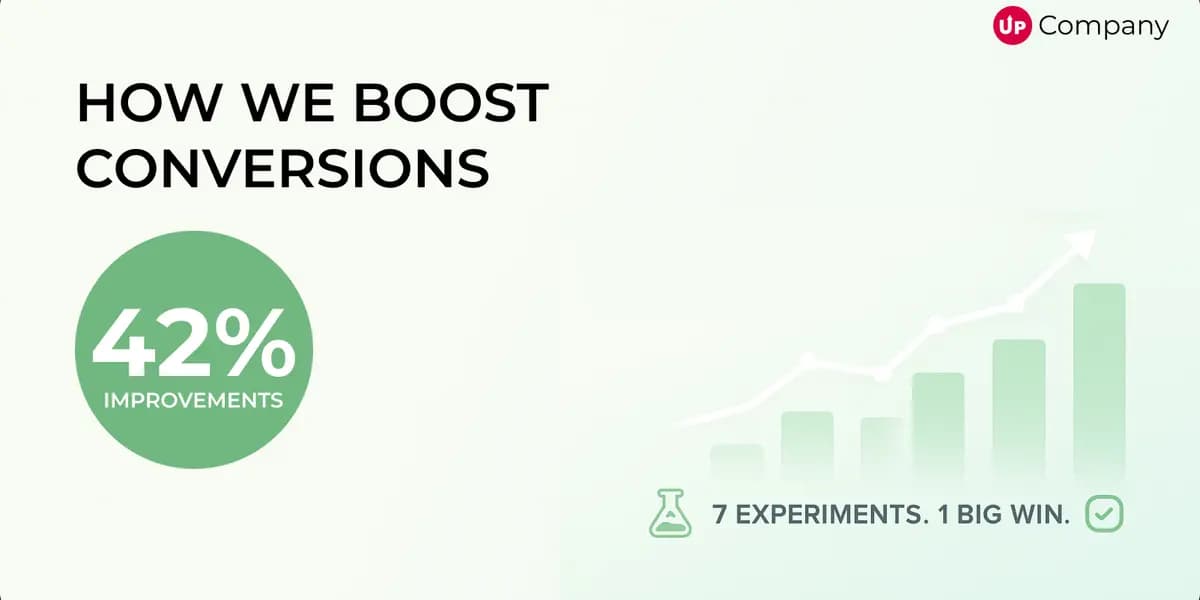
We systematically fixed these issues over the next few months, and their conversion rate jumped from 1.2% to 3.8%. Same traffic, same product, same market. The difference was eliminating friction at every step of their funnel.
Here's the exact checklist we used.
1. Make Your Value Prop Impossible to Miss
I can't tell you how many websites I audit where I have to scroll, click, and hunt around just to figure out what the company actually does.
Your homepage headline isn't a place to be clever or mysterious. It's your one shot to immediately communicate why someone should care about what you're offering.
"Revolutionary solutions for modern businesses" tells me nothing. "Help B2B companies get 30% more qualified leads in 90 days" tells me everything.
Look at your homepage right now. Can a complete stranger understand what you do and why they should care in under 5 seconds? If you have to think about it, the answer is probably no.
Your value proposition should be the very first thing people see, in the biggest, clearest text on your page. Everything else can wait.
2. Fix Your Call-to-Action Buttons
"Click here" and "Submit" are not call-to-action buttons. They're conversion killers.
Your CTA should tell people exactly what happens when they click. "Get pricing" is better than "Learn more." "Download free guide" is better than "Submit." "Book 15-minute call" is better than "Contact us."
And please, make your buttons look like buttons. I've seen too many sites where the most important clickable element on the page looks like decorative text.
Test different colors, different words, different sizes. A client once increased their conversion rate 41% by changing their button text from "Start free trial" to "Create my website." Same offer, different words.
3. Speed Up Your Site Before You Lose Everyone
Here's a harsh truth: if your site takes more than 3 seconds to load, you're hemorrhaging potential customers.
I don't care how beautiful your design is. I don't care how compelling your offer is. If people have to wait around for your page to load, most of them won't.
This is especially brutal on mobile, where people are even less patient and connections are often slower.
Run your site through Google PageSpeed Insights right now. If you're scoring below 80, you have work to do. Compress your images, ditch the auto-playing videos, and clean up your code.
Speed isn't just a nice-to-have anymore. It's table stakes.
4. Stop Ignoring Mobile Users
More than half your traffic is probably coming from phones. If your site isn't designed for mobile-first, you're basically telling half your potential customers to go somewhere else.
I see this all the time: sites that look gorgeous on desktop and completely fall apart on mobile. Tiny text that requires zooming. Buttons that are impossible to tap with your thumb. Forms that disappear behind the keyboard.
Pull out your phone right now and try to navigate your own site. Better yet, try to complete the action you want visitors to take. If it's frustrating for you, imagine how your visitors feel.
5. Give People a Reason to Trust You
Nobody's giving you their email address, phone number, or credit card information unless they feel safe doing it.
Trust isn't built with a "Trust us!" banner. It's built with social proof, testimonials, security badges, and transparent policies.
Show me that other people like me have worked with you and been happy. Show me that you're a real company with real people. Show me that my information will be secure.
Generic testimonials don't count. "Great service! - John D." tells me nothing. "Increased our leads by 200% in the first month - Sarah Johnson, CEO of TechCorp" tells me everything.
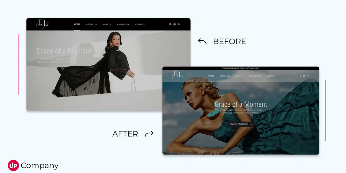
6. Use Images That Actually Help
Stock photos of people pointing at laptops don't build trust. They destroy it.
Every image on your site should serve a purpose: demonstrate your product, show your team, prove your results, or support your message.
If you're selling software, show screenshots of the actual interface. If you're a service provider, use photos of your real team. If you're an ecommerce business, invest in professional product photography.
Irrelevant visuals are just distractions that pull attention away from what really matters: your offer and your call-to-action.
7. Test Everything Instead of Guessing
I've been wrong about what will work more times than I can count. The headline I was sure would convert better flopped. The button color that seemed obviously superior got ignored.
That's why you test instead of assume.
Change one thing at a time and measure the results. Try different headlines. Test different CTA copy. Experiment with different page layouts.
Don't test everything at once or you won't know what actually made the difference. And don't stop testing after three days because you think you see a trend. Let tests run until they reach statistical significance.
Your opinions don't matter. Your visitors' behavior does.
8. Simplify Your Navigation
Your website navigation should not require a PhD to figure out.
If someone lands on your homepage and can't immediately see how to get to your pricing, your services, or your contact information, you've already lost them.
I worked with a company that had 47 different pages linked from their main navigation menu. Forty-seven! Nobody has time to hunt through that maze.
Stick to the essentials. If something isn't directly helping people understand your offer or take action, it probably doesn't belong in your main navigation.
9. Make Your Forms as Short as Possible
Every form field is a barrier between you and a conversion. The more information you ask for upfront, the fewer people will complete your form.
Do you really need their company size before they can download your whitepaper? Do you really need their phone number before they can see your pricing?
Ask for the minimum viable information to start a relationship. You can always collect more details later in the process once they're more invested.
I once helped a client increase their form completion rate by 67% just by removing three "optional" fields. Even optional fields create friction.
10. Actually Look at Your Data
You can't improve what you don't measure. If you're not regularly reviewing your analytics, you're flying blind.
Set up conversion tracking so you know which traffic sources and pages are actually generating results. Use heatmaps to see where people are clicking (and where they're not). Watch session recordings to understand how people actually use your site.
Most business owners check their analytics about as often as they check their smoke detector batteries. That's not often enough.
Schedule a monthly analytics review. Look for patterns in your data. Find the pages where people consistently drop off. Identify the traffic sources that convert best.
Your analytics are telling you exactly where your conversion problems are. You just have to pay attention.
The Real Secret: Consistency Beats Perfection
None of these optimizations will transform your business overnight. But implemented systematically over time, they compound into serious results.
The websites that convert best aren't necessarily the prettiest or the most innovative. They're the ones that consistently remove friction from the user experience.
Every month, pick one element from this checklist and improve it. Test different approaches. Measure the results. Move on to the next item.
Your competition is probably not doing this work. They're focused on getting more traffic while ignoring the traffic they already have.
That's your opportunity.
Start with the item on this list that you suspect is causing you the biggest problems. Fix that first. Then work your way through the rest.
Your conversion rate is just a series of small improvements waiting to happen. The question is whether you'll make them before your competitors do.
Start Your Project
Ready to turn your next idea into something people actually remember?
We help brands build sharper websites, stronger content systems, and digital experiences that convert with clarity.